
My project this week is to prepare for an upcoming exhibit I have scheduled at a local gallery as part of their Arts at the Station series (the gallery is in a vintage train station).
They sent out a call for artists and as part of my ongoing project to get out there more, I applied with a proposal for a black and white dramatic landscape show — and was accepted!
Back in November 2018, I wrote about my plans to become a bit braver in my approach in a post I called “100 Nos“. The plan is to aim for 100 rejections. By doing this, I actively seek the answer “no” and am extra happy when a “yes” comes my way. This exhibit is one of the yesses – and I’ve had quite a few yesses in the last few months – some I can’t quite believe!
This week, I’m prepping the show so my brain is full of black and white images. I thought I’d write a bit about my B&W post-processing that is a large part of the preparation.
For those of you following this blog, don’t think I missed the irony of posting a photo challenge last Friday calling for Bright Colors and then posting on B&W on Monday morning!
A big “shout-out” to Jack Curran – a local fine art black and white photographer. I’ve been taking classes and workshops with him and he’s really helped me see what is possible in B&W. Check out his work – he’s AMAZING!! He also has a set of educational videos if you want to learn more. A lot of my processing comes from his teaching.
I realized a couple of things when I started figuring out B&W.
- Not every image works in B&W
- B&W doesn’t have to be drab.
Choosing Images
Until I worked with Jack, I really didn’t understand B&W. I’m a color-baby at heart and stripping the color out of an image just made it look gray and drab.
As I look back over my collection, the photos that I’d turned into B&W were mainly photo journalism. I guess all those years seeing newspaper photos in B&W influenced my vision.

I started to explore how I could turn landscapes into B&W. I started with my Tuscany photos. We’d visited Tuscany during the summer and the fields weren’t all that colorful to start with.
Photos that I like in spite of not being colorful have B&W potential. Some of my snowy landscapes for instance look almost the same in color and B&W.

When I look for images that have potential in B&W, I look for images where the color may not be particular attractive or may actively be distracting. I also look for compositions with strong lines and form that stand on their own without color.
I really like images that have the possibility to glow in B&W. They may not have color, but I’m still looking for magic in the lighting and the overall effect.
Processing
My teacher has a strong sense of the dramatic and I really loved that. Until I saw Jack process an image, I didn’t really know you were allowed to do that to an image. He really opened my eyes and allowed my creativity to come out. I became much more adventurous in my post-processing in B&W – pushing the limits to capture a sense of the dramatic.
Let me take you through the general processing of a B&W image that I created for my upcoming exhibit.
I don’t usually show my original raw files, but if I’m going to walk you through the post-processing, let’s start at the beginning. If you’ve never seen the original raw file that photographers start with, you may be surprised at how much the photo changes from the time we take the photo to when we’re ready to publish it.

I like this image a lot, but there’s not a lot of color. What the image does have is atmosphere from the foggy morning and shapes and layers I could work with in the hills. The tree is a strong focal point and I can work with that.

Live classes are FREE!!!
The first thing I did was convert to B&W and add contrast. I like contrast generally, but in B&W I really like a lot of contrast. I also cropped in tightly to the tree and took advantage of the leading line coming in from the left bottom corner of the frame.
Then I went dark – really dark. I love the sense of drama that B&W allows. I sometimes go minimalist white, but for this image I liked the darkness. I added a strong vignette to highlight the subject, in this case the lone tree in the Tuscan fields. The vignette (darkened corners) also holds the viewer’s eyes in the photo. I’m going to adjust this darkness as I go, but this gives you a flavor for how I start processing many of my B&W images.

With the background and sky dark, I now started building up the light parts using brushes and radial filters in Lightroom. These tools allow me to target certain areas and bring up the exposure, the highlights and the whites. I can also darken down areas to add more contrast between the light part of the image and the dark part of the image.

25% off your first order from Moo
I spend a lot of time on this stage of the processing. I look at where the light is coming into the scene and where the light might fall on the hills. I emphasized any light in the scene and highlighted layers created by the fog. I tend to start small and layer on the effects, making the image lighter and lighter as I go.

I then added more light. In B&W images, I can actually change the direction of where the light is coming into the scene and create a spotlight effect on the tree. I basically created sunlight that wasn’t in the original image (Yes – I can!) In a color image, this probably wouldn’t work, but in B&W it’s absolutely possible.
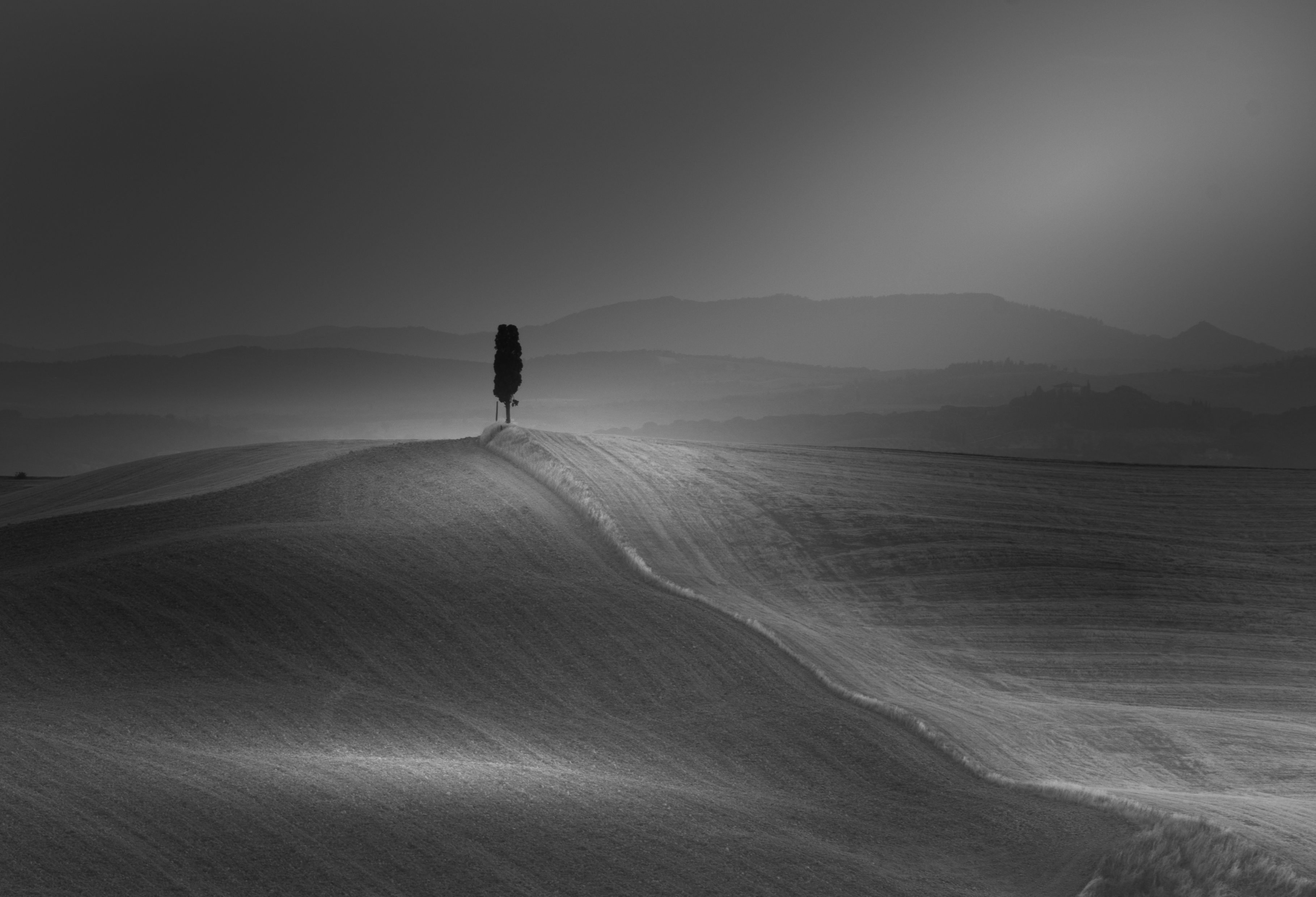
I tweaked the photo quite a bit more, bringing out layers and darkening areas other areas which makes the lighter areas pop even more.
I’m going for a soft, moody effect. It’s important that I don’t overdo any of my modifications.


Conclusion
I’m still finalizing the 20 images or so that will go into my B&W exhibit. A few I published before I was accepted to the show, but others I think I will wait to unveil at the exhibit. Here are a couple that probably won’t make the show, but I love all the same!
Let me know if you have a favorite – maybe I’ll reconsider…
You can see more of my B&W photos on my website.


Check Out CreativeLive’s Free On-Air Classes
For more photos, follow me on social media: Facebook,Instagram, Website, Flickr

Shape, contrast, texture is my usual mantra for B&W….I love your attitude, 100 no’s !! All power to your brain and lens, Jenn!
LikeLiked by 1 person
Thank you for the walk-through. Very nice. I really like the moody result. 100 no’s reminded me that years ago an author I knew wrote a rejection slip rejection slip: “Dear Editor, Due to the large number of rejection slips I have been receiving recently, I am sorry to tell you that I am unable to accept your rejection slip. Please feel free to try again in the future.”
LikeLiked by 1 person
🙂 When I’m having a hard time with the rejection, I’ll try to remember this letter!
LikeLike
Wow that is awesome..
LikeLiked by 1 person
[…] really hit home with me. I’ve talked a couple of times about my 100 “Nos” project (and here). For this project, I’m trying to collect 100 people saying “no” to me. Along the […]
LikeLike